CSS animation provides web developers with a robust toolset to infuse vitality into their designs, resulting in enhanced engagement and interactivity.
By leveraging the capabilities of CSS, animations can transform static web pages into dynamic experiences, captivating users and improving overall user experience.
Among the many features CSS offers, animations stand out as a powerful tool that can enhance user experience, making websites more dynamic and engaging.
However, to fully leverage CSS animations, it’s crucial to understand their impact on Search Engine Optimization (SEO) and adhere to best practices.
This article provides an in-depth look at CSS animations, their SEO implications, and the best practices to follow.
What is CSS Animation?
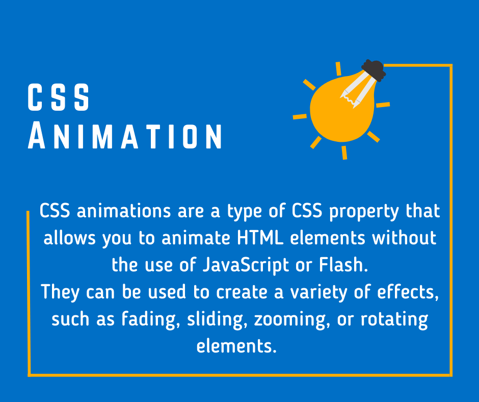
CSS animations are a type of CSS property that allows you to animate HTML elements without the use of JavaScript or Flash.
They can be used to create a variety of effects, such as fading, sliding, zooming, or rotating elements. CSS animations consist of two main components: keyframes, which define the animation’s stages, and animation properties, which specify how the animation should behave.
Web developers employ CSS animation as a proficient approach to incorporate dynamic movement and seamless transitions to various elements within a webpage.
It enhances user experiences by creating visually engaging and interactive designs, making the website more appealing and captivating to visitors.
Transitions and Easing
Apart from keyframes, CSS transitions offer a straightforward approach to animating elements between two different states.
By applying the transition property to an element, you can specify the duration and easing function of the transition. Easing functions govern the speed variations and changes in velocity throughout the animation, influencing the way motion is perceived.
CSS offers various easing options, such as linear, ease-in, ease-out, and ease-in-out. Experimenting with different easing functions can greatly enhance the overall user experience.
Animation Properties
1. @keyframes
@keyframes in CSS animation defines animation sequence, specifying intermediate states for HTML elements.
  <style>
    .fadeInElement {
      opacity: 0;
    }

    @keyframes fadeInAnimation {
      from {
        opacity: 0;
      }
      to {
        opacity: 1;
      }
    }

    .fadeInElement {
      animation-name: fadeInAnimation;
      animation-duration: 1.5s;
      animation-fill-mode: forwards;
    }
  </style>
2. Animation-name:
Within CSS animation, the property animation-name enables the assignment of a distinct name to the animation being applied to an element.
  <style>
    .fadeInElement {
      opacity: 0;
    }

    @keyframes fadeInAnimation {
      from {
        opacity: 0;
      }
      to {
        opacity: 1;
      }
    }

    .fadeInElement {
      animation-name: fadeInAnimation;
      animation-duration: 1.5s;
      animation-fill-mode: forwards;
    }
  </style>
3. Animation-Duration:
Animation-duration is a CSS property that specifies the duration over which an animation should be completed.
  <style>
    .fadeInElement {
      opacity: 0;
    }

    @keyframes fadeInAnimation {
      from {
        opacity: 0;
      }
      to {
        opacity: 1;
      }
    }

    .fadeInElement {
      animation-name: fadeInAnimation;
      animation-duration: 1.5s;
      animation-fill-mode: forwards;
    }
  </style>
4. Animation-delay:
In CSS animation, animation-delay is a property that specifies the delay before an animation starts.
.fade-in {
  width: 100px; height: 100px; background-color: blue; opacity: 0;
  animation: fadeIn 1s ease-in-out forwards;
}

@keyframes fadeIn {
  0% {
    opacity: 0;
  }
  100% {
    opacity: 1;
  }
}

.fade-in:nth-child(1) {
  animation-delay: 0s;
}

.fade-in:nth-child(2) {
  animation-delay: 0.5s;
}

.fade-in:nth-child(3) {
  animation-delay: 1s;
}
5. Animation-Iteration-Count:
Within CSS, the attribute “animation-iteration-count” defines the repetition count for an animation loop.
.fade-in-out {
  animation-name: fadeInOut; animation-duration: 2s; animation-iteration-count: infinite;
}

@keyframes fadeInOut {
  0% { opacity: 0; } 50% { opacity: 1; } 100% { opacity: 0; }
}
6. Animation-Direction:
The “animation-direction” property in CSS animation determines the direction in which the animation plays, such as forward or backward.
| Value | Description |
| normal | “normal” in animation-direction sets the animation to play forward from the starting keyframe to the ending keyframe. |
| reverse | “Reverse” in CSS animation-direction plays the animation backward from the end to the start, providing a reverse effect. |
| alternate | “alternate” is a value for the “animation-direction” property in CSS animation, causing the animation to play forwards and then backwards in a continuous loop. |
| alternate-reverse | “alternate-reverse” in CSS animation-direction plays animation forward and then backward, repeating in reverse order. |
.card {
  width: 200px; height: 300px; background-color: #f1f1f1; border-radius: 10px; animation-name: flipCard;
  animation-duration: 2s; animation-iteration-count: infinite; animation-direction: alternate;
}

@keyframes flipCard {
  0% {
    transform: perspective(800px) rotateY(0deg);
  }
  100% {
    transform: perspective(800px) rotateY(180deg);
  }
}
7. Animation-Timing-Function:
The CSS “animation-timing-function” property governs the animation’s speed variations and pace, controlling acceleration and deceleration.
| Value | Description |
| ease | “Ease” in CSS animation-timing-function creates a smooth animation with a gradual start and end, providing a natural transition. |
| linear | “Linear” in animation-timing-function creates a constant speed throughout the animation without acceleration or deceleration. |
| ease-in | “ease-in” in CSS animation-timing-function creates a smooth, gradual acceleration effect at the beginning of the animation. |
| ease-out | “ease-out” in CSS animation-timing-function creates a gradual deceleration effect, starting fast and slowing down towards the end. |
| ease-in-out | “ease-in-out” in animation-timing-function is a CSS value that provides a gradual acceleration and deceleration effect during animation. |
| cubic-bezier(n,n,n,n) | The “cubic-bezier(n,n,n,n)” in animation-timing-function allows custom control over the acceleration and deceleration of an animation. |
@keyframes fadeIn {
  0% {
    opacity: 0;
  }
  100% {
    opacity: 1;
  }
}

.card {
  animation-name: fadeIn; animation-duration: 1s; animation-timing-function: ease-in-out;
}
8. Animation-Fill-Mode:
animation-fill-mode in CSS defines the state of an element before and after animation. It avoids reverting to default values.
| Value | Description |
| none | The value “none” in animation-fill-mode indicates that the element retains its initial styles before and after animation. |
| forwards | “forwards” in animation-fill-mode retains the animation’s end state after completion, freezing the element at its final position. |
| backwards | “Backwards” in animation-fill-mode fills animation properties to the start of the animation. |
| both | “both” in animation-fill-mode applies both the animation’s initial and final states to the element. |
  <style>
    .fadeInElement {
      opacity: 0;
    }

    @keyframes fadeInAnimation {
      from {
        opacity: 0;
      }
      to {
        opacity: 1;
      }
    }

    .fadeInElement {
      animation-name: fadeInAnimation;
      animation-duration: 1.5s;
      animation-fill-mode: forwards;
    }
  </style>
SEO Implications of CSS Animations
While CSS animations can significantly enhance the visual appeal of a website, they can also impact SEO if not used correctly.
Search engines like Google prioritize websites that offer a seamless user experience, which includes fast loading times and mobile-friendly designs. Heavy use of CSS animations can slow down a website, negatively affecting its SEO ranking.
Moreover, search engines cannot interpret the content within animations as they do with static text.
Therefore, important information should not be embedded solely within animations.
Instead, use animations to complement the content and ensure that all vital information is also presented in a text format that search engines can understand.
Best Practices for CSS Animations
- Keep it Simple: While it’s tempting to create complex animations, it’s best to keep them simple and subtle. Overuse of animations can be distracting and may slow down your website, negatively impacting user experience and SEO.
- Optimize Performance: To prevent animations from slowing down your website, optimize them for performance. This can be achieved by using properties that do not trigger layout changes, such as transform and opacity.
- Ensure Accessibility: Make sure your animations are accessible to all users. Provide options to pause, stop, or hide animations and ensure they don’t trigger any adverse physical reactions in sensitive individuals.
- Use Progressive Enhancement: This approach involves building your website’s core functionality with simple technologies and then enhancing it with more advanced features like CSS animations. This ensures that your website remains functional even if the animations fail to load.
- Test Across Different Browsers: Not all browsers interpret CSS animations in the same way. Therefore, it’s crucial to test your animations across different browsers to ensure they work as intended.
Popular CSS Animation Libraries
CSS animation libraries provide pre-built, easy-to-use animations that can save you time and effort when designing your website. Here are some popular CSS animation libraries:
- Animate.css: This is one of the most popular CSS animation libraries. It offers a wide range of ready-to-use animations, from simple fades and slides to more complex animations like bouncing, flipping, and zooming.
- Hover.css: As the name suggests, Hover.css is a collection of CSS3 powered hover effects. It includes a variety of effects such as 2D transitions, background transitions, border transitions, icon animations, and more.
- AOS (Animate On Scroll): This library allows you to animate elements as you scroll down the page. It’s highly customizable and easy to use, making it a great choice for adding scroll animations to your website.
- Magic Animations: Magic Animations is a unique CSS3 animation library. It offers a variety of unique, fun animations that you won’t find in many other libraries.
- Bounce.js: Bounce.js is a JavaScript library that allows you to create beautiful CSS3 powered animations. The animations created with Bounce.js have a more dynamic and energetic feel.
- CSShake: This library provides CSS classes to move or shake DOM elements in a beautiful way. It’s perfect for drawing attention to specific elements on your page.
- Keyframes.app: Keyframes is a free animation library and a web-based tool that allows you to create, share, and implement custom animations to your projects.
- Anime.js: While not strictly a CSS library, Anime.js is a lightweight JavaScript animation library that works with any CSS properties, individual CSS transforms, SVG or any DOM attributes, and JavaScript Objects.
Remember, while these libraries can be incredibly helpful, it’s important to use animations sparingly and thoughtfully to avoid overwhelming your users and negatively impacting your website’s performance and accessibility.
Conclusion:
CSS animations can be a powerful tool for enhancing the visual appeal and interactivity of your website.
However, it’s crucial to use them responsibly, considering their impact on SEO and user experience.
By following the best practices outlined in this article, you can create engaging animations that not only delight your users but also improve your website’s SEO performance.
Remember, the key to successful CSS animations lies in balance. Use them to enhance your content, not overshadow it, and always prioritize the needs of your users and the requirements of search engines.
With careful planning and execution, CSS animations can be a valuable addition to your web design toolkit.