User experience (UX) holds immense significance in the domain of web design and development, as it plays a vital role in attracting and retaining the attention of website visitors.
Web design is an art where creativity meets structure, and CSS (Cascading Style Sheets) is the magic wand that empowers this amalgamation.
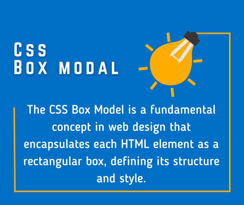
One fundamental aspect of CSS that aids in giving structure to the art of web design is the CSS Box Model.
This article provides an in-depth exploration of the CSS Box Model, explaining its significance, structure, and properties, as well as tips for using it effectively.
What is CSS Box Modal?
In CSS, each HTML element is represented as a rectangular box. The CSS Box Model is a conceptual layout model that encapsulates this idea, serving as a cornerstone for all web design and layout.
It defines how these elements interact with each other, how they stack, how space is distributed around them, and how they are visually rendered on a page.
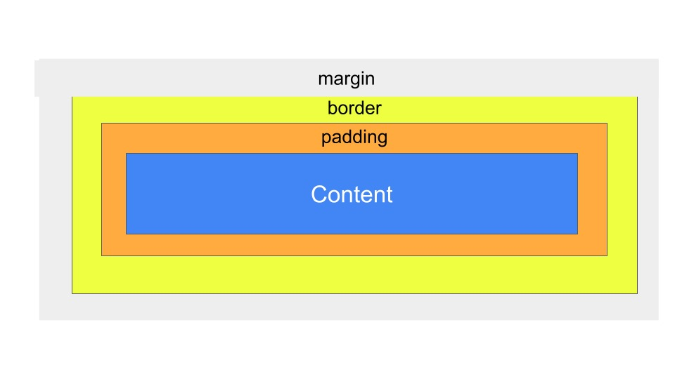
Each box, or HTML element, consists of four distinct parts. From the innermost to the outermost, these are:
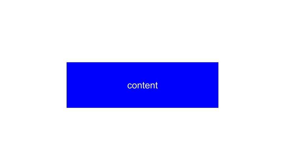
1. Content Box:
This is where text, images, or other media live. The dimensions of the content box are determined by the ‘width’ and ‘height’ properties.
The content within a CSS box modal should be concise, relevant, and professionally presented. It should convey the essential information or actions to the users in a clear and engaging manner, utilizing headings, bullet points, and visually appealing elements like high-quality images or icons.
Avoid excessive details that may overwhelm or distract the users, maintaining a focused and professional approach.
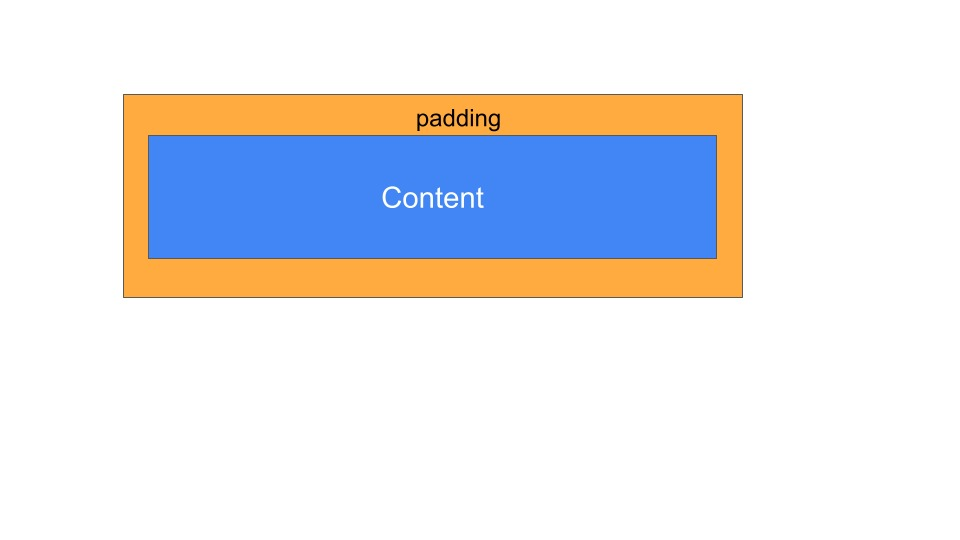
2. Padding Box:
Surrounding the content box is the padding area, which extends the content box to create space around the content. The size of the padding box is regulated by the ‘padding’ property.
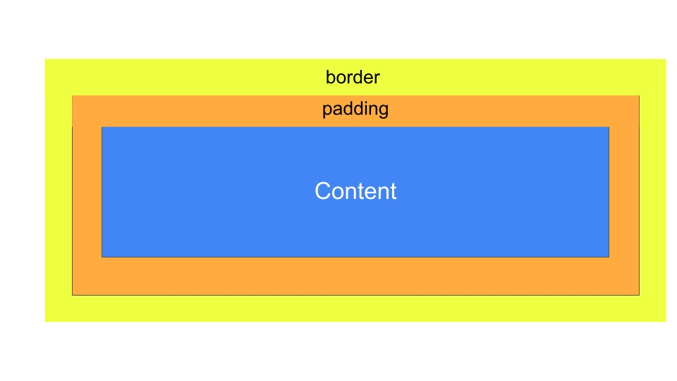
3. Border Box:
The border box wraps the padding box. It is controlled by the ‘border’ property and can be styled using various attributes like ‘border-style’, ‘border-width’, and ‘border-color’.
4. Margin Box:
The outermost layer of the box is the margin box. This defines the space between an element and its surrounding elements, controlled by the ‘margin’ property.
CSS Box Model Properties
Each part of the CSS Box Model has unique properties that can be adjusted to achieve the desired layout and design. Let’s dig into the specifics of these properties:
- Content: The ‘width’ and ‘height’ properties directly affect the content box. By default, these properties only include the content itself and do not consider padding, border, or margin.
- Padding: The ‘padding’ property creates space around the content inside an element, enhancing readability and aesthetic appeal. Padding values can be defined for all four sides of the box together or individually.
- Border: The ‘border’ property adds a line around the padding and content. The width, style (solid, dotted, dashed, etc.), and color of this line can be customized to create distinctive designs.
- Margin: The ‘margin’ property allows you to specify space outside the element’s border. It separates an element from its neighboring elements, providing balance and order in the layout.
The Box-Sizing Property
The ‘box-sizing’ property is a significant addition to the CSS3 specification, offering a convenient way to control the box model’s behavior. It has two values: ‘content-box’ and ‘border-box’.
- ‘content-box’ is the default value. It means the width and height properties only apply to the content box, not including padding or border.
- ‘border-box’ changes this behavior so that width and height include the content, padding, and border. This makes sizing elements much more intuitive, especially when dealing with responsive design.
Mastering the CSS Box Model
Effectively using the CSS Box Model is a vital skill for any web designer. Here are a few tips to master it:
- Understanding the Interplay: Comprehend how different parts of the box model interact with each other and how altering one property can affect others.
- Practice: Use online tools like JSFiddle or CodePen to practice your box model skills. Experiment with different elements and their properties.
- Debugging: Utilize browser developer tools to inspect elements and their box model properties. This can help you understand how different elements are rendered and how space is distributed around them.
- Responsive Design: Embrace ‘box-sizing: border-box’. It makes working with percentages and responsive design much more straightforward.
Conclusion:
The CSS Box Model is a fundamental concept that shapes the web design world. Understanding and mastering it is crucial to creating visually compelling and structurally sound web layouts.
With its quartet of properties – content, padding, border, and margin – the CSS Box Model grants designers the power to craft beautifully organized websites with ease and precision. Happy designing!