CSS plays a fundamental role in the ever-evolving realm of web design, enabling the creation of visually captivating and polished websites.
With the right CSS layout techniques, web developers can enhance the user experience, improve accessibility, and streamline the design process.
Throughout this piece, we will delve into the various techniques and properties that CSS offers to control and manipulate web-page layouts.
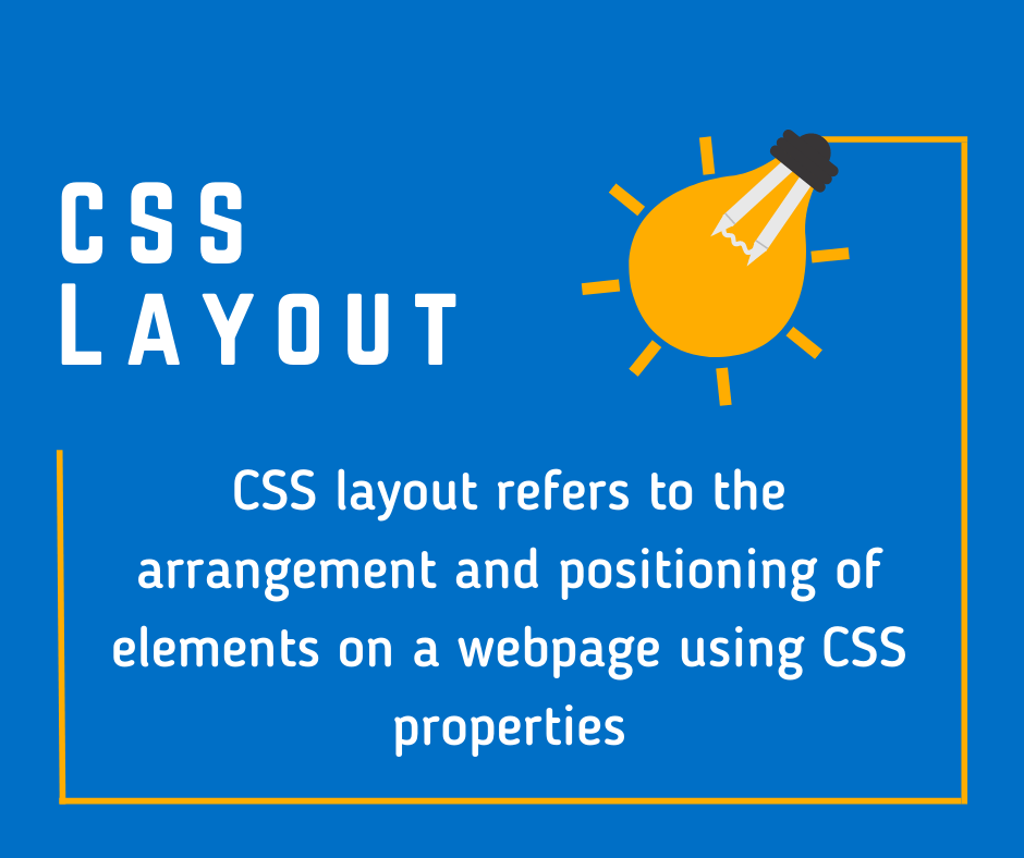
What is CSS Layout?
CSS layout refers to the arrangement and positioning of elements on a webpage using CSS properties.
A professional CSS layout involves employing responsive design techniques, utilizing grids, flexbox, and CSS frameworks, and considering accessibility to create visually appealing and user-friendly web designs.
To master CSS layout, it’s important to grasp some fundamental concepts:
1. The Box Model:
Everything in CSS is considered a box – text, images, div elements, and so forth. This model defines how these “boxes” interact with each other. The box model describes the padding (space inside the box), border (edge of the box), and margin (space outside the box).
2. Display Property:
The display property determines how an element is displayed. The primary display types are block, inline, and inline-block.
3. Positioning:
CSS provides various methods for positioning elements including static, relative, absolute, fixed, and sticky. Each of these positioning methods allows for different ways to control where and how elements are displayed on the screen.
CSS Layout Techniques
Let’s explore some essential CSS layout techniques that every developer should know.
1. Normal Flow
The Normal Flow, or Flow Layout, is the default layout model where block elements are displayed vertically, one after the other, while inline elements are displayed horizontally, fitting as many on the same line as they can. This is the basic way that CSS lays out pages without any additional layout techniques applied.
2. Flexbox
The Flexible Box Layout, more commonly known as Flexbox, is a one-dimensional layout model designed for the flexible alignment and distribution of space along a single column or row. The main idea behind the flex layout is to give a container the ability to alter its items’ width and height to fill the available space. This is especially useful for different screen sizes and resolutions.
3. Grid Layout
The CSS Grid Layout is a two-dimensional layout system, meaning it can handle both columns and rows. It has revolutionized how we create complex layouts by offering a grid-based layout system, with rows, columns, and gaps. Grid is very powerful and flexible, allowing for easy alignment of content, building complex designs, and even recreating familiar layouts like the 12-column grid.
4. Multi-column Layout
The CSS Multi-column Layout is a specification that allows content to flow from one column to another. This is handy when dealing with large amounts of text that you’d like to present in a more readable, newspaper-style format.
Modern Layout Properties
CSS continues to evolve, with newer properties making it easier to create complex, responsive designs.
- CSS Box Alignment: This module includes properties that can be used with flexbox, grid, and other layout models. It provides alignment control both vertically and horizontally, offering properties like
justify-content,align-items, andplace-content. - Responsive Design: CSS Media queries allow the page to use different CSS styles depending on characteristics of the device the site is being displayed on, most commonly the width of the browser.
- CSS Shapes: This allows geometric shapes to be set, in order to define the flow of the content around that shape. This allows for more complex and interesting layouts.
Conclusion
The CSS layout is a versatile and dynamic domain in web development. Understanding the core concepts like the box model, display properties, positioning, normal flow, flexbox, grid, and multi-column layouts forms the foundation of being proficient in CSS layout. As CSS continues to evolve, new techniques and properties are introduced, further enhancing the way we design and interact with the web.